
Microsoft Is Working on a Copilot Design System
Microsoft has too many Copilot surfaces. Word, Excel, PowerPoint, Outlook, Teams, Windows, Edge, Loop — each one has its own Copilot button, panel, and behavior. That is not a product strategy. It is a coordination problem, and it is exactly the kind of problem a design system is supposed to solve.
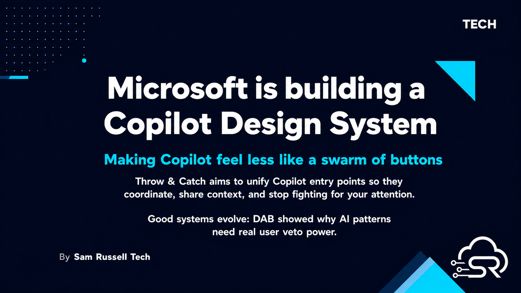
John Friedman, Microsoft 365 Chief Design Officer, is leading work on a unified Copilot Design System. The reported goal is to make Copilot feel ambient rather than intrusive. That is the right goal. It is also the hardest goal in product design.
The DAB failure is not a setback
The same research effort that produced the design system also produced the Dynamic Action Button (DAB). It floated in the bottom-right of Office apps. Excel users hated it. Microsoft walked it back. That sounds like a failure. It is not. It is proof the process is working.
A design system that never ships a pattern users reject is a design system that is not testing anything. The DAB was a probe. The reaction was loud, specific, and useful. Microsoft now knows exactly what ambient Copilot does not look like. That information is worth more than a button nobody complained about.
Throw & Catch
The more interesting concept is "Throw & Catch". Entry points coordinate with each other. They hand off context. When one Copilot surface is active, the others recede. The user is not competing for attention with the interface.
That is a sensible model. It treats Copilot as a single agent distributed across surfaces instead of a set of disconnected assistants. The execution matters, of course, but the model is correct.
The bigger risk is not the concept. It is Microsoft's track record with unified experiences. Teams still feels different from Office. Copilot behaves differently depending on which app you are in. Personal and enterprise Copilots are still separate identities. If the design system ships without fixing those seams first, users will just notice that the inconsistency is now consistent.
What good looks like
A successful Copilot Design System needs to do three things. First, every Copilot entry point must read the same intent and context. If I ask Copilot in Word about a document, then move to Excel, the Excel Copilot should know what the Word Copilot was doing.
Second, the interaction model must degrade gracefully. If a surface cannot support a full Copilot experience, it should show a reduced form that still feels connected to the whole. A lightweight entry point is fine. A disconnected entry point is not.
Third, Microsoft needs to let users control the system. The DAB backlash happened because the button was unremovable. Users do not want fewer choices. They want better orchestration of the choices they already have. A design system that removes options instead of coordinating them will fail the same way the DAB did.
The real test
The test is not whether Microsoft can design a system. It is whether it can enforce the system across product teams that have historically shipped their own Copilot experiences. That is an organisational problem, not a design problem. Design systems fail when engineering teams treat them as suggestions.
If Microsoft can align product groups around one Copilot design language, the result will feel like a single product instead of a portfolio. That is a meaningful difference for anyone who uses M365 daily. One Copilot across Word, Excel, PowerPoint, Outlook and Teams is not just cleaner. It is faster.
For Australian professionals using Microsoft's stack in enterprise, this matters. Less Copilot noise means less mental rearrangement between tools. Faster context handoff means less retyping. A design system that actually works is the difference between AI that helps and AI that demands attention.
Source
Source: Neowin — Microsoft is working on a "Copilot Design System"
Connect with me on LinkedIn.